This is Noon, a 1939 Benton painting from the collection at the Whitney Museum of American Art, and I hope you can see the resemblance I’m talking about. There’s something about the warm color palette, and the way that Benton always seemed to render everything in a sort of rubbery, rounded way that I think meshes well with the overstuffed sofa-like lines of late ’40s automotive design. There is, of course, a strong thematic and cultural link as well, as it would be incredibly easy to imagine that truck hanging out in the background of that undulating farmscape. Did you know Thomas Hart Benton taught Jackson Pollack? Look at some of Pollack’s pre-action painting works and you’ll see the resemblance.
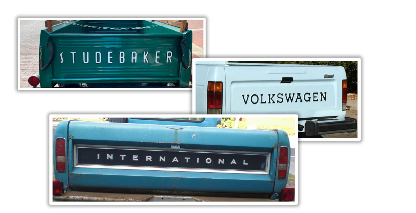
This Studebaker truck also got me wondering about what the longest automaker name that’s been on a truck tailgate might be. Studebaker is pretty long at 10 letters, but it’s matched by Volkswagen. The winner seems to be International, which clocks in at 13 letters! I can’t think of a longer name that may have been on a tailgate, but as soon as I say things like that, usually some commenter will find something to prove that wrong. I guess we’ll find out! I’ve heard this dude say it countless times and it still gives me a headache trying to say it. https://www.youtube.com/watch?v=fHxO0UdpoxM “They’re typefaces, not fonts!” /s The premise is that he couldn’t find a decent truck for the then-standard $200, so he decided to buy one and go through it completely. Some great drawings (not high-art, but understandable to even non-car people) and digressions. The final chapter sums up the reality that a project is never done in a wry & relatable manner. Highly recommended! I was pretty sure the artist would be findable since the postwar years were a high point for American illustration used in advertising and the clear quality of the rendering would have left this person in regular demand. I haven’t seen this specific illustration with attribution, but Frederic Tellander produced many Studebaker advertising images often with complicated background scenery and the color palette and brushwork is very similar to this image. Of course, this being the era of less is more (except when more is more) then we might just have a small badge on the back somewhere instead of the awesomeness that is the full width lettering.


